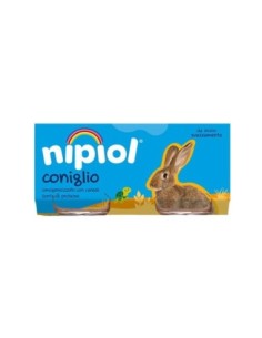
New Baby Food Nipiol Homogenised with Rabbit - 160 g Nipiol EB073 €3.29 Nipiol Homogenised with Rabbit is a nutritious and gentle option for babies. With carefully selected ingredients, it offers a source of high-quality protein and essential nutrients for growth. Ideal for introducing new flavours into their diet. Imagine a serene moment at the table, with your little explorer discovering the taste of variety. Nipiol's... Add to Box
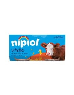
New Baby Food Nipiol Homogenised with Veal - 160 gr Nipiol EB072 €3.40 Nipiol Omogeneizzato con Vitello is a nutritious and gentle option for babies. With carefully selected ingredients, it offers a source of high-quality protein and essential nutrients for growth. Ideal for introducing new flavours into their diet. Imagine a serene moment at the table, with your little explorer discovering the taste of variety. Nipiol's... Add to Box
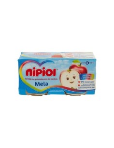
New Baby Food Nipiol Homogenised with Apple - 160 g Nipiol EB071 €1.95 Nipiol Omogeneizzato con Mela" (Nipiol Homogenised Fruit Mix with Apple) is the perfect choice for the sweet tooth! This delicious combination of fresh fruit and nutrients is designed to satisfy children's demanding palates. Each spoonful of this homogenised product is loaded with vitamins and natural fibre to promote healthy growth and a balanced diet.... Add to Box
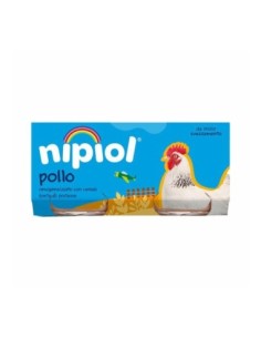
Sale New Baby Food Nipiol Homogenised with Chicken and Cereal - 160 g Nipiol EB070 €2.99 €3.45 Nipiol Homogenised with Chicken and Cereal is the perfect meal for little explorers! With a balanced mix of high-quality horse meat and nutritious cereals, this baby food provides a tasty and healthy combination for your baby. Each spoonful is packed with essential vitamins and minerals to promote healthy growth and development. Thanks to its delicate,... Add to Box
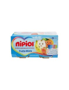
New Baby Food Nipiol Homogenised Mixed Fruit - 160 g Nipiol EB069 €1.99 Nipiol Omogeneizzato con Frutta Mista" (Nipiol Homogenised Mixed Fruit) is the perfect choice for the little ones with a sweet tooth! This delicious combination of fresh fruit and nutrients is designed to satisfy children's demanding palates. Each spoonful of this smoothie is loaded with vitamins and natural fibres to promote healthy growth and a balanced... Add to Box
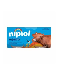
Sale New Baby Food Nipiol Homogenised with Beef and Cereal - 160 g Nipiol EB068 €2.99 €3.45 Nipiol Homogenised with Beef and Cereal is the perfect meal for little explorers! With a balanced mix of high-quality beef and nutritious cereal, this baby food provides a tasty and healthy combination for your baby. Each spoonful is packed with essential vitamins and minerals to promote healthy growth and development. Thanks to its delicate and creamy... Add to Box
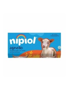
Sale New Baby Food Nipiol Homogenised with Lamb and Cereal - 160 g Nipiol EB067 €2.99 €3.45 Nipiol Homogenised with Lamb and Cereal is the perfect meal for little explorers! With a balanced mix of high-quality horse meat and nutritious cereals, this baby food provides a tasty and healthy combination for your baby. Each spoonful is packed with essential vitamins and minerals to promote healthy growth and development. Thanks to its delicate and... Add to Box
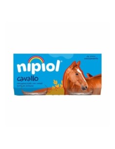
Sale New Baby Food Nipiol Homogenised with Horse and Cereal - 160 gr Nipiol EB066 €2.99 €3.45 Nipiol Homogenised with Horse and Cereal is the perfect meal for little explorers! With a balanced mix of high-quality horse meat and nutritious cereals, this baby food provides a tasty and healthy combination for your baby. Each spoonful is packed with essential vitamins and minerals to promote healthy growth and development. Thanks to its delicate,... Add to Box
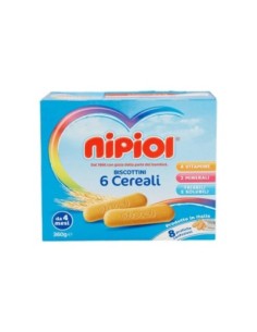
New Childhood and Child Biscuits Nipiol Biscuits with 6 Cereals - 360 gr Nipiol EA004 €4.69 Designed to develop children's manual dexterity with taste and nutrition! The Nipiol Biscottini ai 6 Cerali are ideal for weaning your child from 6 months onwards: with only 100% selected flours, 4 vitamins and 2 minerals, they are also egg-free, without hydrogenated fats or colouring and preserved! Their composition makes them crumbly, to munch dry at... Add to Box